Background
A startup’s initial branding is crucial, but as the company grows, outdated branding can hinder customer engagement and talent acquisition. Delaying a rebrand only increases the amount of content needing updates later. Early on, we faced issues like inaccessible color schemes, low contrast, conflicting visual messaging, and a limited color palette. Addressing these became essential to ensure our branding resonated with our audience and conveyed our message clearly and cohesively.
Task
As the leader of the design team, my main responsibility was to identify gaps in our existing branding and align them with our evolving needs. This involved a thorough assessment of current branding elements compared to future requirements. I led the exploration, iteration, and launch of a new brand identity while ensuring the seamless continuation of everyday design projects. This multifaceted approach required skilled multitasking and effective delegation to maintain momentum across all design initiatives.
Overcoming Accessibility and Messaging Challenges
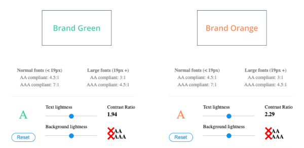
Our branding faced significant challenges due to accessibility issues. Our brand colors didn’t meet AA accessibility standards, limiting their use in presentations and UI elements and hindering cohesive visual representation.
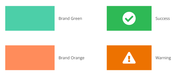
In the tech industry, conflicting visual messaging is a unique challenge. Our brand colors overlapped with success and warning indicators, causing confusion and inconsistency. This issue complicated the integration of branding colors into the UI and made it difficult to convey information through product diagrams. As a result, colors like orange were underutilized to avoid negative connotations.
Partial brand update
Enhancing Accessibility and Color Options
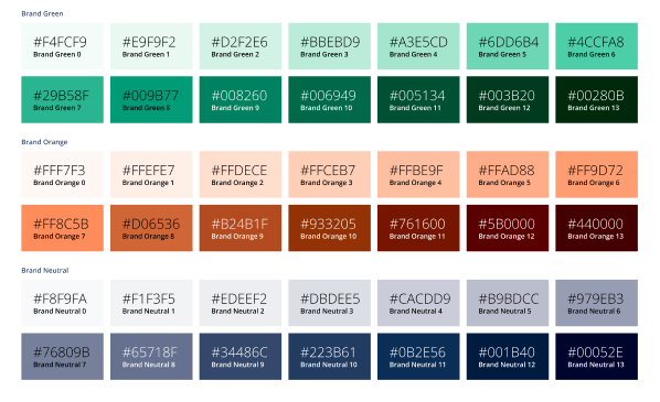
To tackle our accessibility challenges, we introduced a neutral blue color ramp and expanded our brand colors into full ramps. This strategic move not only improved overall accessibility but also provided designers and employees with a wider range of options for their artifacts and presentations. By offering a more diverse palette, we empowered everyone to create visually compelling materials while ensuring adherence to accessibility standards.
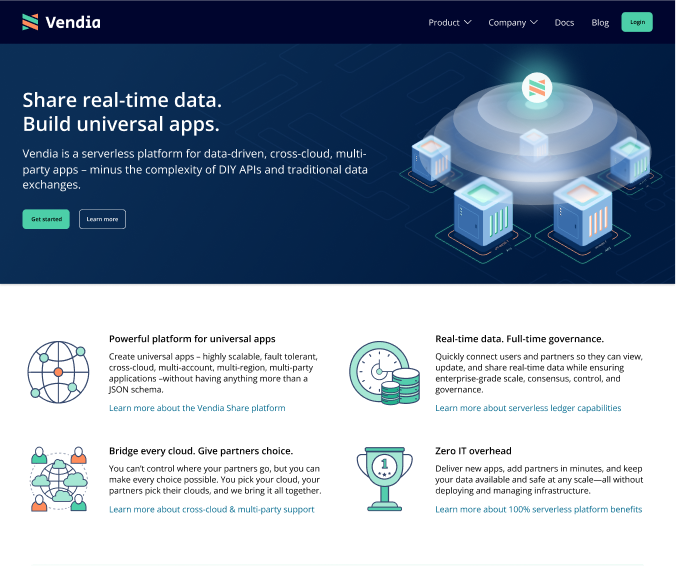
Leading a Comprehensive Website Overhaul
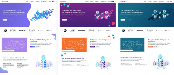
In my first month at Vendia, coinciding with the arrival of a new VP of Marketing, our top priority was a complete website overhaul. This included redesigning content, messaging, graphics, and colors to align with our refreshed branding strategy.
I led a design contracting team tasked with executing the website redesign. Our goals were to introduce graphical elements that aligned with the new branding and to seamlessly integrate product diagrams with our overall design elements. Through strategic design and meticulous execution, we aimed to enhance the website’s visual appeal and cohesiveness while effectively communicating Vendia’s value proposition.
Focused Product Update
In our initial product update, we concentrated on three key objectives:
- Updating Colors for Improved Accessibility: Enhanced color schemes to meet accessibility standards, ensuring inclusivity and usability.
- Introducing Graphical Elements: Incorporated graphical elements to clarify complex concepts and add warmth and approachability.
- Designing and Implementing UX Functionality: Refined components, composites, and page templates for an optimized, intuitive user experience.
Prioritizing usability and functionality, we left room for future CSS adjustments to accommodate an eventual brand redesign. This strategic choice allowed us to focus on user-centric improvements while remaining flexible for future updates.
Crafting Effective Web-Based Advertisements

Rebrand explorations
Initiating a Comprehensive Branding Update
To avoid future rework, I started stakeholder interviews about six months into our branding efforts. The goal was to understand how our branding was being used internally and externally, identify gaps and challenges, and define our branding objectives. By gathering insights from key stakeholders across the organization, we aimed to ensure alignment and buy-in for the upcoming branding update.
Exploring Alternative Branding Options
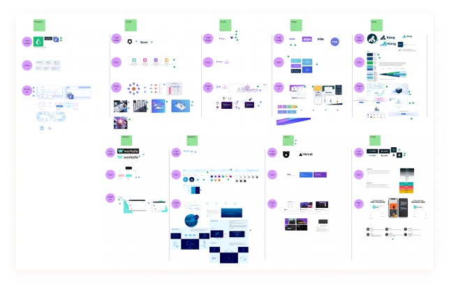
In March 2022, I led a design off-site focused on addressing our branding pain points and exploring new options. We began by evaluating the branding of companies like Prisma, Auth0, Fauna, Stripe, Netlify, Kong, Workato, MuleSoft, and Vercel.
We gathered elements such as logos, icons, graphics, colors, and typography from each company. As a team, we assessed what was working and what wasn’t for each brand, and discussed what could potentially work for us.
Crafting Vendia’s Unique Brand Identity
After evaluating competitors’ branding strategies, we categorized similarities and identified key differentiators. Using this analysis, my team developed three distinct branding options that we believed reflected Vendia’s identity and aligned with our goals.
Curating and Assessing Branding Styles
Using guidelines for our three branding styles, my team curated graphic examples showcasing each style’s distinct elements. We then collaborated to evaluate these images, identifying commonalities and unique attributes.
This iterative process allowed us to pinpoint key differences and provided a platform for exploration and enthusiasm. By immersing ourselves in visual examples and engaging in collective discussion, we deepened our understanding of each branding option’s nuances, fostering excitement and ownership among team members for upcoming design projects.
Bringing Branding Styles to Life
Once the three style guidelines were established, my team created concept art for each style. This included website home pages, product dashboards, SWAG designs, iconography, isometric graphics, color ramps, and logo usage. This exercise immersed designers in each style, providing tangible representations for various contexts.
Designers compared and refined designs against the guidelines, fostering iterative improvement. While personal preferences varied, I ensured the team appreciated elements from each option. This approach kept the team enthusiastic and invested, regardless of the final style chosen.
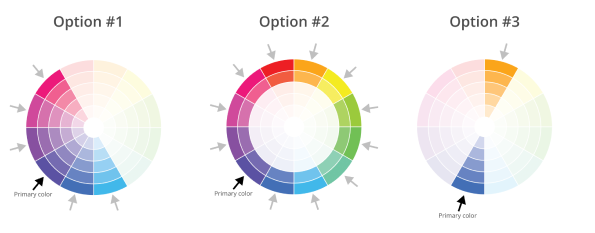
Presenting the Final Branding Options
We conducted a dry run of the branding options with the marketing team, including the VP of Marketing, to gauge initial reactions and refine our presentation based on their feedback.
Next, we presented to our Co-Founders, CEO, and CBO. The leadership team’s engagement and enthusiasm were evident as they deliberated and exchanged perspectives on each design option.
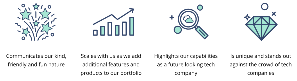
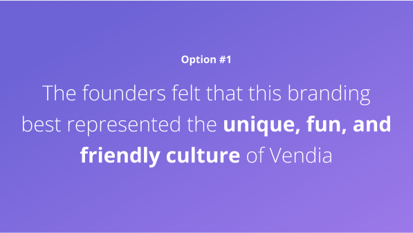
Ultimately, option #1 was selected for its unique, fun, and friendly representation of Vendia’s culture, resonating deeply with the company’s values and vision.
Roll out of new branding
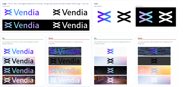
Logo Redesign and Documentation
My team explored alternate logo designs, presenting three distinct options to our CEO and CBO. These included representations of the product’s nature, blockchain technology, and a playful version of the original overlapping V’s logo. The leadership chose the playful iteration.
To ensure branding consistency, we developed comprehensive design documentation. This included clear guidelines for logo usage with various colors and distinctions between the icon and full logo. These guidelines ensured uniformity and coherence in brand representation across all touchpoints.
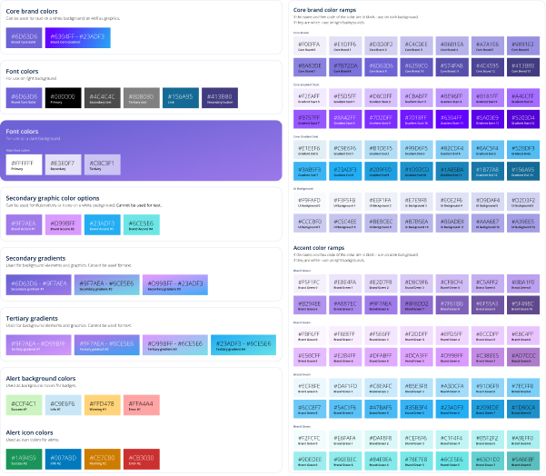
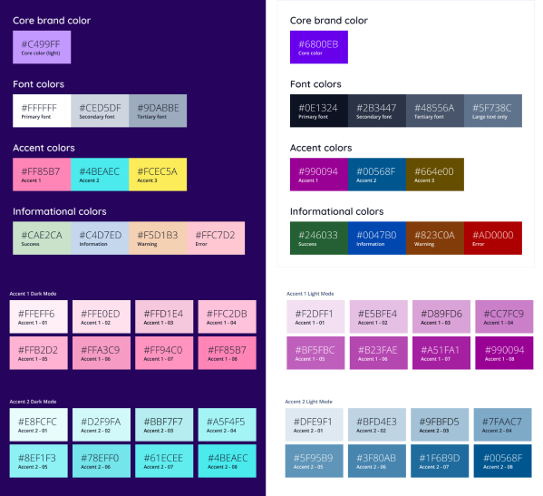
Establishing Comprehensive Color Guidelines
Following the logo design, we focused on defining color usage and ramps. We established a set of core, accent, and informational colors accessible to the entire company. These were expanded into gradients and ramps, offering designers flexibility.
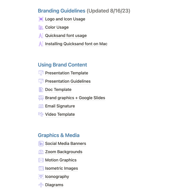
To ensure consistency, these colors were integrated into our Figma and Google Suite color libraries and documented on our design hub. We created clear guidelines for color use with the logo, distinguishing between the icon and full logo. This documentation was essential for maintaining uniformity across all design assets and materials.
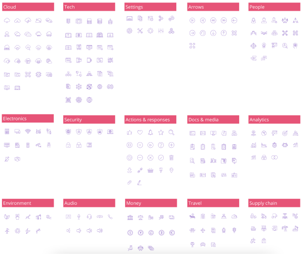
Expanding the Icon Toolkit
Continuing our branding efforts, my team curated an extensive toolkit of over 680 icons in five different colors. To streamline accessibility, these icons were integrated into Figma as components, documented on our design hub, and made accessible via a dedicated Google Drive folder. This ensured team members could easily use these icons in Google Suite presentations or documents.
The icons were instrumental in creating diagrams and motion graphics that explained Vendia’s complex infrastructure, effectively communicating intricate concepts in a visually engaging manner and reinforcing our brand messaging.
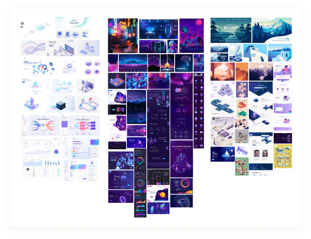
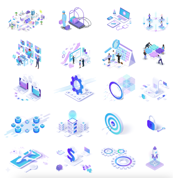
Embracing Isometric Graphics for Branding
In evaluating the three branding options, we noticed a common use of isometric graphics that embodied Vendia’s friendly and fun nature. Recognizing their importance, we invested in isometrics before finalizing the branding decision. This allowed us to build a robust library of over 230 isometric images, recolored and textured to match our new branding.
These graphics were integrated into Figma, documented on our design hub, and stored in a Google Drive folder for easy access. Their versatility enabled widespread use across our website, social media, presentations, and the Vendia Share product, enhancing visual appeal and reinforcing our brand messaging.
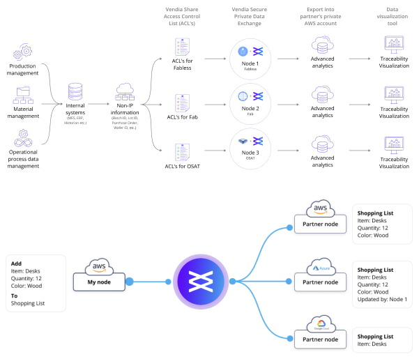
Crafting Comprehensive Diagrams for the New Branding
Using our new iconography, my team updated all existing diagrams and created over 85 new ones for our branding launch. These diagrams illustrated Vendia’s workings across various use cases and industries.
Available in raw format on Figma, they were easy to modify as needed. We also documented them comprehensively and stored them in a Google Drive folder for easy access.
These diagrams enhanced understanding and communicated Vendia’s value proposition, prominently featured on our website, in presentations, and at events, effectively explaining complex concepts to our audience.
Updating and Expanding Motion Graphics
Using our new branding, my team updated all existing motion graphics and created a series of new ones leading up to the launch.
By launch, we had curated a library of over 62 motion graphics, easily accessible through a dedicated Google Drive folder and documented in our design hub. This resource became the second most utilized documentation page, particularly by our sales team. Salespeople could browse and request modifications, streamlining communication and enhancing efficiency.
This collaborative approach fostered synergy between our sales and design teams, maximizing the use of our creative assets.

Streamlining Social Media Advertising
Recognizing the need for rapid ad creation, especially with a marketing team twice the size of the design team, we developed a solution to streamline the process. My team created templates for various ad sizes and Figma components for quick editing. These templates allowed marketers to easily customize ads, speeding up creation and deployment.
We provided clear documentation on using the templates and integrating existing graphics, available on our design hub. This approach enabled faster testing and iteration for the marketing team while freeing up design resources for custom ads and critical projects. This collaborative effort optimized efficiency and productivity, driving greater impact and success in our advertising endeavors.
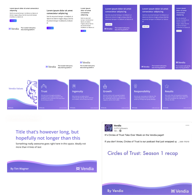
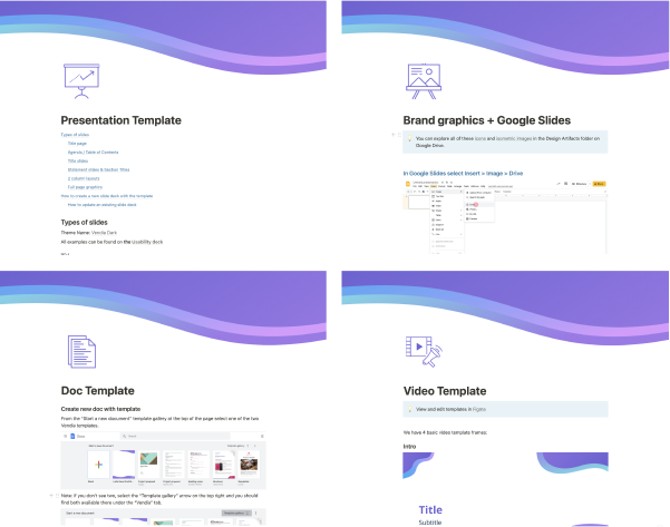
Creating Consistent and Polished Branded Content
To ensure consistent and polished branded content, my team developed templates for presentations, documents, and videos. These templates allowed employees to easily create content that met brand standards. Comprehensive documentation on our design hub detailed how to use these templates effectively, helping new colleagues quickly produce high-quality content.
These documentation pages became the most-used resources within the company. Recognizing their importance, our CEO and CBO added messaging-related guidelines for presentations, ensuring these resources served as central repositories for essential information and tools used regularly by employees.
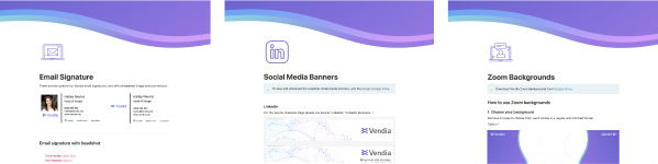
Expanding Media Assets for Consistent Branding
In addition to templates for presentations, documents, and videos, my team developed media assets including Zoom backgrounds, social media headers, and email signature templates. These assets ensured all Vendia employees, including newcomers, projected a polished and cohesive brand image across various digital platforms. By providing ready-to-use assets for common communication channels, we empowered every team member to maintain a professional and consistent appearance, reinforcing Vendia’s brand identity in all interactions.
Successful Rollout Preparation and Presentation
Over 13 weeks, my team focused on both the rebranding initiative and routine design projects. I ensured all assets were accessible and documented in our design hub before the launch. In August 2022, we introduced the new design hub at the company all-hands meeting. We walked through all available content and resources, explaining how each asset could be effectively used. This comprehensive overview equipped every team member with the knowledge and tools to seamlessly integrate the new brand elements into their workflows and communications.
Some quotes from the roll out:
“Sweet! Coinbase was like 7-8 years in before they managed to get to this!” – Tim W – CEO
“BIG thanks to the Design Team!!! Thank you ❤️” – Shruthi R – CBO
“This is amazing to see, especially so early in our journey as a company. Well done!” – Tim Z – VP of Marketing
“Words cannot describe how excited this makes me. Way to unlock the entire company on the design front. 👏” – Anders M – Product Marketing
Branding expanded
Branding “Circles of Trust” Podcast
Following our branding rollout, the marketing team launched a podcast titled “Circles of Trust,” playing on Vendia’s concept of collaboration within a Venn diagram framework.
Although sponsored by Vendia, the podcast covers broader industry themes. The marketing team wanted branding that connected to Vendia but had its own unique identity.
In response, my team designed a logo and cover art blending Vendia’s branding with unique elements for “Circles of Trust.” This branding was later animated and incorporated into video versions of the podcast, enhancing its visual appeal and coherence with Vendia’s overall aesthetic.

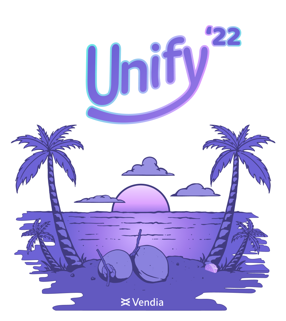
Unify: Our Annual Company Event
Unify, our three-day annual event, brings together our remote-first workforce for learning, bonding, and fun. Held in sunny San Diego, CA, we wanted branding that reflected its laidback, vibrant vibe.
Working with leadership, my team developed three logo options, selecting the one that captured Unify’s essence. We created collateral like documents, presentations, print media, and name tags, all echoing the playful and inviting spirit of Unify and the energy of sunny Southern California.
Branding iteration
Reevaluating Our Branding Strategy
In June 2023, we reassessed our branding strategy to better reflect our company’s needs and target audience. While our existing branding showcased Vendia’s friendly and vibrant culture, it didn’t effectively communicate the trustworthiness, security, and real-time capabilities of Vendia Share. As we shifted focus to enterprise business decision makers, we realized our branding needed a more corporate-friendly aesthetic.
We embarked on a rebranding effort to retain key elements of our original designs while infusing a more professional vibe. This aimed to align better with our strategic objectives and communicate Vendia Share’s value to our target audience.
Collaborating for a Comprehensive Brand Overhaul
Following our decision to iterate on our branding, we welcomed a new VP of Marketing, marking the start of a comprehensive overhaul of our content, messaging, and narrative. Collaborating closely with the VP of Marketing, SVP of Product, CEO, CBO, VP of Sales, and Solution Architect team, I ensured that all newly created content received proper visual representation.
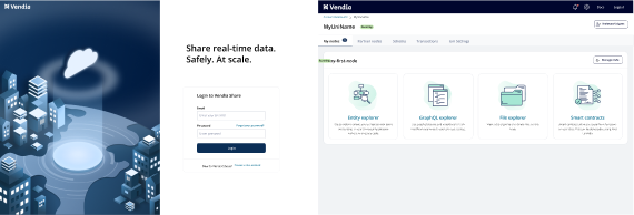
Our team, consisting of a visual designer, a creative director, and a WordPress developer, played a pivotal role in this effort. The redesign coincided with the launch of several no-code features in Vendia Share, allowing us to incorporate screenshots and walkthroughs into our website. This replaced the previous isometric placeholders and provided a more authentic and informative portrayal of Vendia Share’s capabilities, enhancing our communication of its value proposition to our audience.

Swift Integration of No-Code Features with Updated Branding
With the recent addition of several no-code features to Vendia Share’s UI, updating the branding was relatively straightforward. We utilized CSS exclusively to implement the necessary changes, completing the entire process within 24 hours. This quick turnaround ensured minimal disruption to ongoing operations while seamlessly aligning the product’s visual identity with the updated branding.
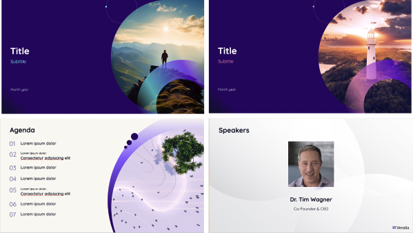
Aligning Presentations with Updated Branding
Recognizing the need to align our presentations and assets with the new branding, I led an initiative with a visual designer and creative director. We crafted a corporate-friendly template that captured the revamped branding’s essence. Our focus was on meticulously documenting and recording all changes in familiar locations to ensure easy access for employees, minimizing disruptions during the transition.
Leveraging our expertise and attention to detail, we implemented the new template, ensuring our presentations and assets reflected the latest branding while seamlessly integrating into employees’ existing workflows.